Order and Disorder
Brief:
Theme
The theme of this project is order and disorder. In all of the work I produce, I aim to make the disparity between the two exceedingly clear . The word order is typically associated with symmetry, balance and collation whereas disorder with chaos and confusion. Whilst including work relating to both terms, I will show the heavy contrast between the two.
Research
I intend to research I number of artists relevant to the project and create a variety responses incorporating the key concepts of their work. As I develop my project I will use the work of other photographers to help me decide which strand I wish to continue.
Materials and Processes
I plan to use pixlr, the online editing program to correct my photographs as well as photo-shop, which I may use to make gifs or merge images. I will also use a tripod, if required to capture images with a longer shutter speed, to prevent blurring.
Outcome
I aim to produce a relevant final piece summing up the project integrating the work of artists I have researched.
Mindmap
|
Places
houses -messy/neat contrast gardens -over grown derelict places power of man pollution Natural World man vs nature animals |
Activities
sport movement/still blurred Objects patterns arrangement of objects recycled objects -waste -rubbish >old vs new |
People
emotion -calm/anger/sadness/frustration -stress/worry |
Photographer/artists with work relating to order and disorder:

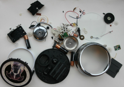
Todd McLellan
Todd Mclellan's 'Things come apart' collection shows a number of objects such as mobile phones and fire extinguisher dismantled and reassembled with each part separated. Photographs of each object come in pairs; in one image the objects are arranged randomly and appear scattered and messy. Whereas in the other photograph they are set out a neater more aesthetically pleasing fashion.

|

|
In the first photograph the parts have been assembled neatly, in the shape of a rectangle. Each part is equidistant from the camera so the their size is obvious. The bright yellow dust-like material and the red of the the mental body of the fire extinguisher stand out due to the intensity of their colour, in comparison to the other black and grey parts. In the second image, the parts have been laid out to look as though they are part of an explosion, and some of parts are obviously further from the camera than other making their sizes, compared to one another inconspicuous. Initially the most noticeable thing about this photograph is the yellow powder from inside the fire extinguisher. This is because even thought is a crucial part to the object, it is patently not usually seen and would usually go forgotten, though in the two images is one of the most eye catching things which takes up the most space.

|

|
The sheer quantity of parts required to make up the camera in the photographs is astonishing. In the first image, parts has been arranged so they are not touching one another and have been positioned vaguely in order of size, the larger circular parts, used to make up the lens are on the left hand side, whereas the smaller parts are on the right side in two main areas. The largest, plastic parts used for the body of the camera are positioned with their edges parallel to the edges of the photograph in the center of the image. In the second image, the parts have been positioned seemingly randomly and seem to follow no sort of order. Some objects have been placed on top of each other so the number of parts, obvious in the first image, is unclear. How close in proximity the parts are decreases toward to edges of the image and they appear closest together in the center of the image.
My response
For my response to the work of Mclellan's work I took apart and photographed a remote control and an alarm clock. I took a photograph to represent order, in which all of the parts were arranged as straight and as neatly as possibly. I made sure all of the parts were visable in the photograph and I edited the image using photoshop to increase the saturation so the colour of the wires and other brightly coloured smaller parts were noticeable along side the larger darker coloured parts. I then assembled the parts in a more random, messy looking configuration, I moved them about a bit and photographed them from different angles, on the right side is the best of the photographs.
The first object I decided to dismantle a remote control. The second object, the alarm clock was chosen because I knew it would have far more small parts inside, similar to the objects dismantled by Mclellan.
The first object I decided to dismantle a remote control. The second object, the alarm clock was chosen because I knew it would have far more small parts inside, similar to the objects dismantled by Mclellan.

|

|

|
|
Ursus Wehrli
Ursus Wehrli's 'The Art of Clean Up' features him tidying up, what he sees to be works of art. He photographs small everyday objects such as a bowl of fruit then rearranges them usually in vertical columns. He photographs the objects before and after they are rearranged similarly to Todd Mclellan and both photographs are taken against same background so the images are comparable. As a result the objects within the photograph are what stands out as opposed to what is behind them. The highly saturated colours of the cars and fruit mean the photographs are especially eye catching. Colour is also something that is used to group the objects together when they are 'tidied'.
|
|

|

|
My response:
For my response to Wehrli's work I cut apart part of a pepper plant. I used a knife to carefully remove the pips and the top stem. I cut each segment apart and lined them up neatly. I used photo-shop to increase the saturation on the images so the red of the skin and the yellow pips were particularly noticeable.The second image is especially striking, because it is so absurd looking; the bizarre appearance of Wehrli's work it truly inivative, its originality makes it eye catching.

|

|
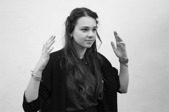
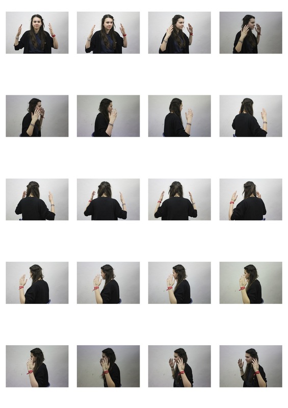
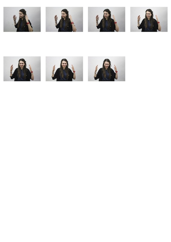
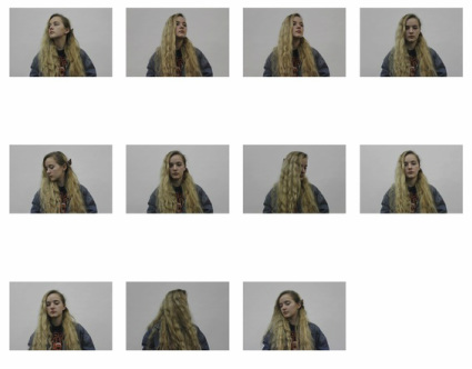
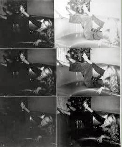
Making gifs
I made a number of gifs using the editing program photoshop. I took a series of around 10 photographs for each one then edited them so the played consecutively over a period of a few seconds repeatedly. I aimed for the person in the photograph to keep their body for the shoulders down still, so the main focus was on the face and hair. I edited some of the gifs into black and white so attention would be initially drawn to the movement as opposed to the colour. The way she is looking directly into the camera in a number of the stills, makes the clip seem oddly eerie.
|
|

Ari Versluis and Ellie Uyttenbroek: Exactitudes
Versluis and Uyttenbroek's series Exactitudes explores fashion subcultures expressed by various social groups internationally. Although the project originated in Rotterdam with its heterogeneous, multicultural street scene, they traveled around the world over 16 year period (1994 - 2010).The word 'Exactuitudes' is a contraction of exact and attitude. By photographing their subjects in identical poses and maintaining a specific dress code they were able to document the effort individuals put into making themselves distinguishable from the rest of society by identifying with a certain social group. Photographs of individuals were set out in three by four columns with only thin black lines separating each image. They proved that the ways in which people could be classified said a fair amount about their personality and their past.

YOUNG ACTIVISTS
The children's seemingly powerful, hands on hips, position contrast heavily with the awkward, uncomfortable expression on their faces. Their layer of jumps are covered by a a stretched, shirts, each covered by a campaign slogan. The over-sized clothing seems to exaggerate their size, making them seem smaller.
|
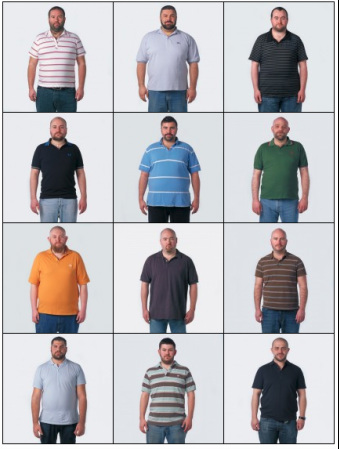
BEARS
Selected for their top heavily, slightly over weight figures , the men stand with their shoulders slumped with their arms hanging awkwardly around their hips. The dull colours of their Tshirts and washed out shade of their jeans seem to match their bland, bored expressions.
|
My response
For my response to Ari Versluis and Ellie Uyttenbroek's Exactitudes I decided to document some of the fashion subcultures in London. I selected three different areas to explore, each involving similar items of clothing, worn by people of a particular age range of the same gender. I choose brightly coloured coats, smartly dressed older men and long slightly oversized puffer coats. I used a tripod and choose to photograph the subjects in front of a certain section large pale grey brick wall. This meant the people were photographed in exactly the same plain looking location, like the Exactertudes where photographed in a studio, so the clothes were what stood out as opposed to the backdrop. I asked each group to pose in a particular fashion, reflecting whatever they were trying to convey through their clothes. For example I asked the men to put their right hand in their pocket, making them look authoritative and to a slight extent overbearing.
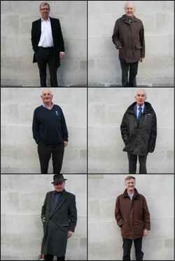
Over dressed old men
|
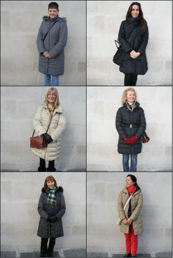
Awkwardly Puffy Coats |

Alarmingly bright coats
|
Typology
Marco Ugolini

|
|
|
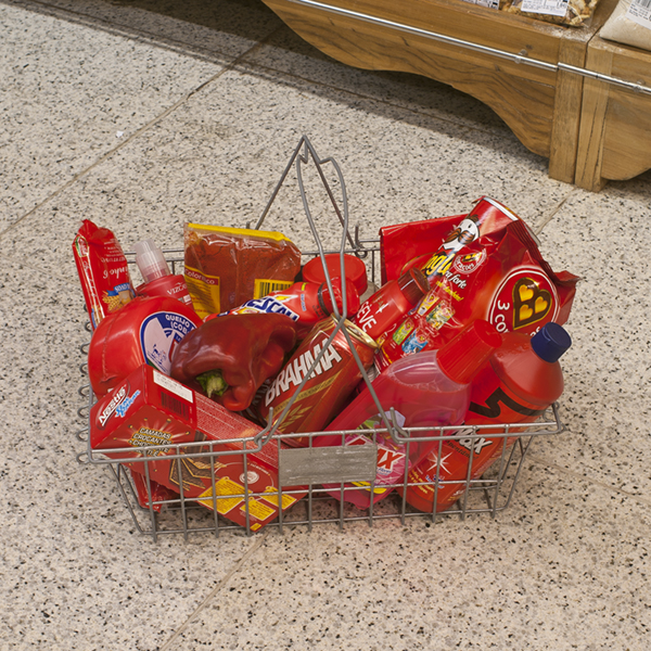
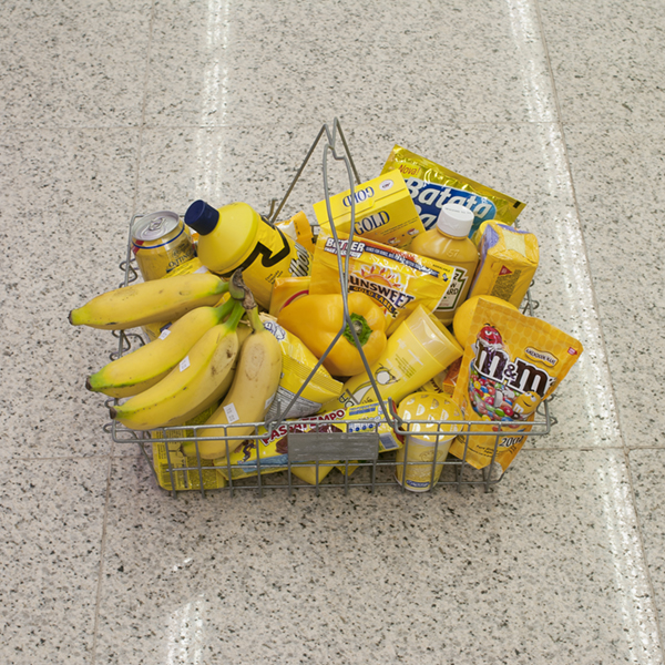
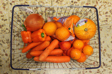
Previously I had photographed people, categorising them on the basis of the way they dressed. I decided to do the same with objects. I visited the supermarket and filled baskets with fruit and vegetables of one colour. I photographed the basket in the same position, in the same location trying to keep them looking as similar as possible so they were easily comparable. I experimented, taking the photographs from a range of angles. The images below show the basket from front on and from directly above.


|


|
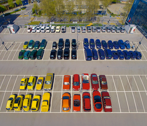
Development
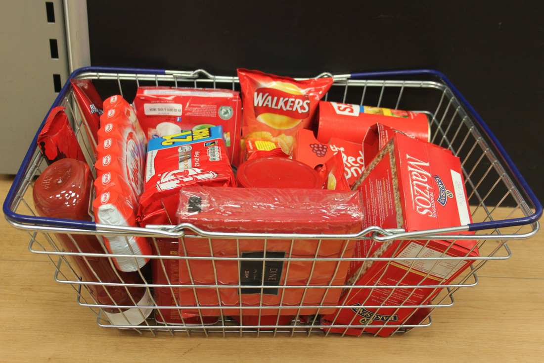
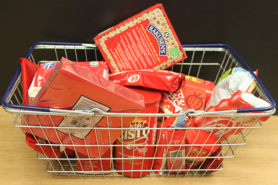
I decided to repeat this, incorporating objects from all around the supermarket as opposed to just fruit and vegetables. This meant there was a more versatile range of colours for me to experiment with and there were a wider selection of object for me to use. I tried to encapsulate the theme of order and disorder in my work, in a number of different ways. I positioned the basket in the same location before photographing it each time so the background was the same and the lighting was a constant; this had previously been an issue.

|

|

|

|

|

|

|

|

|

|

|

|

|

|
I created a gif using the photographs taken from above the baskets of coloured objects. the result proved relatively successful, considering the photographs were not taken at exactly the same angle. This is something I will work on if I choose to create a similar response

I tried in a number of different ways to express the concept of order and disorder in my photographs. I arranged the objects in a neat, orderly fashion and then rearranged so they looked messy and scattered. However the difference between the two sets of photographs wasn't especially noticable.
|
|
I also tried placing one object of a different colour in a basket. I used the colours black and white as because they are obviously strikingly different the extreme contrast would be easily noticeable.

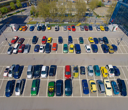
City Disorder
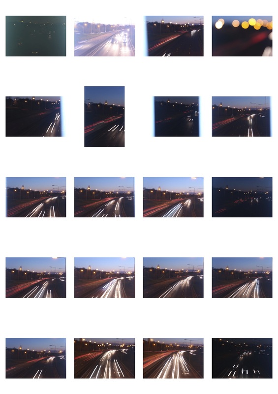
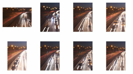
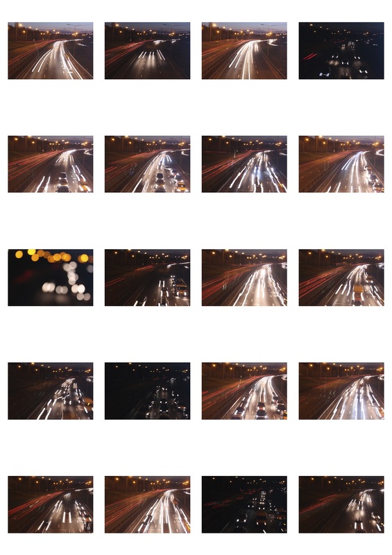
Light trails
These images were taken from a bridge above a motorway, just after dark. I experimented with a range of exposure lengths, the longer the exposure the longer and bright the light trails were and the less visable the bodies of the cars were. I used the IOS setting 100 and a tripod to hold the camera stills so ever though the exposure was longer the photographs were not blurred. I photographed both lanes at once to show the heavy contrast between the colour of the red break lights and white headlights.
|
|

There is a heavy contrast between the white line of lights caused by the headlights on right and the red lines caused by the break lights on the left. The white lines which do not go parallel to the dotted lines on the motor show the cars changing lane. The glowing brightly coloured light stands out compared with the dull semi-dark background.
|
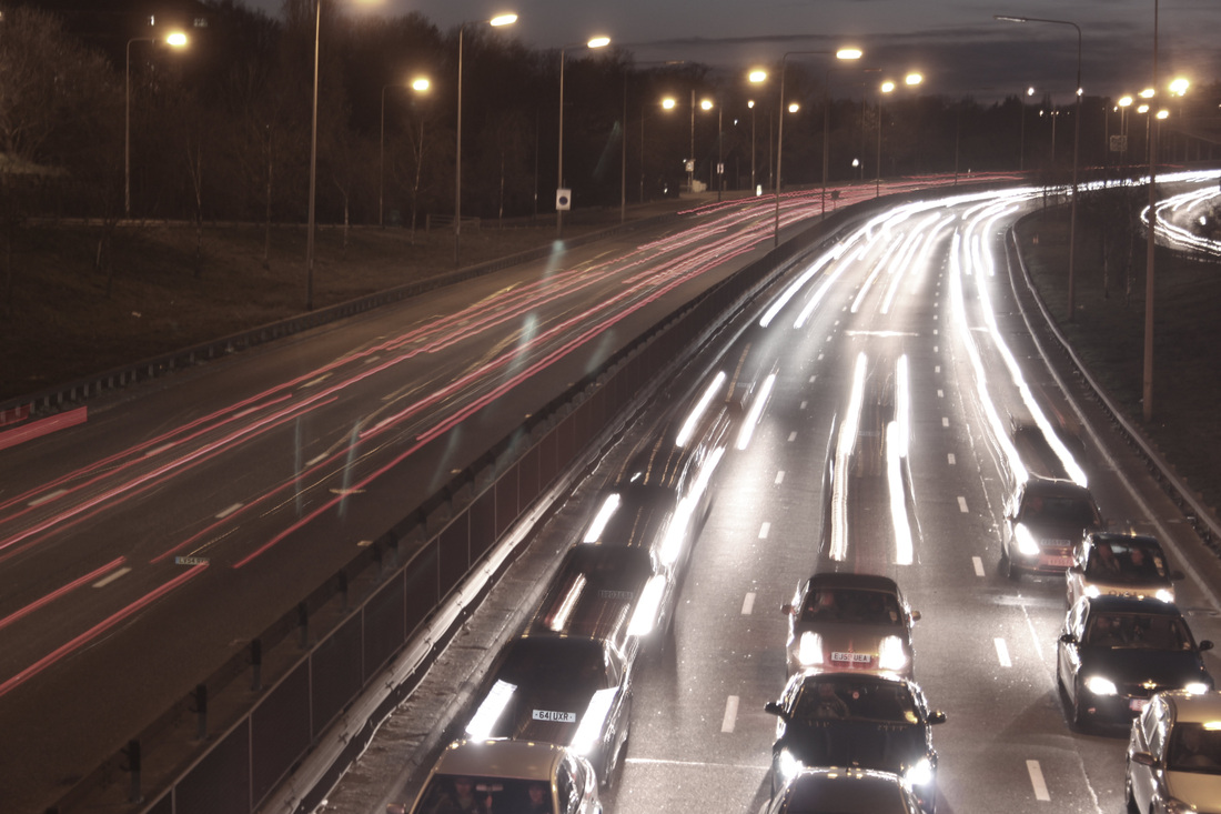
The more in focus the cars are the slower they were moving when the photograph was taken, as have traveled a shorter distance during the exposure. The cars in the foreground where caught in traffic so were practically stationary.
|
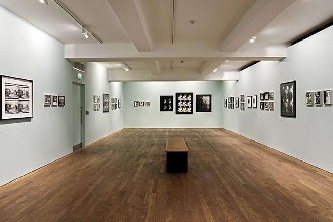
The Photographer's Gallery
In March, I visited the photographer's Gallery on Oxford street to gather inspiration for the rest of my project.

|
|

|
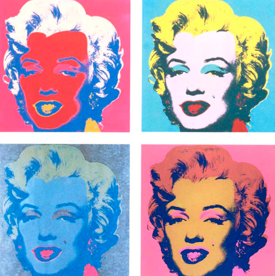
Andy Warhol
"I told them I didn't believe in art, that I believed in photography."
Due to Warhol's success as a painter, filmmaker and colourist, he only decided to focus on photography in its own right later in life. Taking his camera almost everywhere he went, he captured up to forty frames a day. He photographed celebrity parties as well as street scenes, people and everyday details subverting the traditional sociological hierarchy.
Serial and repeated imagery features heavily in Warhol's work; his work in The Photographers Gallery was representative of his desire for balance and order. A series of portraits were presented stitched together using a sewing machine. Tendencies and patterns emerging across in both his photography and his work with other mediums reveal sequence and clear structure to be the centre of his thinking.
Serial and repeated imagery features heavily in Warhol's work; his work in The Photographers Gallery was representative of his desire for balance and order. A series of portraits were presented stitched together using a sewing machine. Tendencies and patterns emerging across in both his photography and his work with other mediums reveal sequence and clear structure to be the centre of his thinking.

|
|

|
|
How is the work on show in this exhibition differ compared to the screen prints that Warhol is most famous for? Are there any similarities? (on the left is an example of Warhol's screen prints) The prints on show in the exhibition were all in black and white, this meant your immediate attention to drawn to the patterns and the objects within the photographs rather than the intense, highly saturated colours. The screen prints were made up of block colours; there was little shading to show depth, whereas the different shades of grey in Warhol's newer work helped give perspective and sense of depth. Similarly to the way in which Warhol's screen prints were presented, the photographs are shown in groups of four |
How does sewing into the image change the image change the photographs? Do multiple prints change the way we look at photographs?
Sewing onto the photographs gives them a three dimensional element. Additionally the obvious attention paid to detail gives them a more personal feel.
Multiple prints of the same image evoke a sense of order. They force the observer to concentrate on exactly what is in the photograph; the first time you looks at them you focus intently on them trying to find a difference between them.
What is the effect of the exhibition design?
The pale blue walls exaggerate the lack of colour in the photographs, looking at them feels like a glimpse into the past. The particular, pale shade of green/blue gives the room a feeling of calmness and serenity. The photographs are presented in frames of different colours, shape and sizes which goes against the elicit sense of order created by the quadruple prints.
David Lynch
"I love industry. Pipes. I love fluid and smoke. I love man-made things. I like to see people hard at work, and I like to see sludge and man-made waste."
David Lynch is an American film director and photographer. His iconic, cinematic technique features heavily in his photographs. The photographs in Lynch's 'The Factory Photographs' collection were shot in a variety of locations including German, Poland, New York and England. Over the space of a number of years Lynch photographed deserted factories partially taken over by the natural world. His work cleverly depicts the on going battle between the grey, metallic made world and nature. In the room in which the exhibition was taking place the distance sound of machine whirring and metal scraping was audible.

|

|
Lynch is known predominantly for his work as a film maker, how is this apparent in his photographic work?
The enigmatic visual language he uses to entice his audience is present in both his films and his photography. Shooting in abandoned locations and the use of black and white to evoke a melancholic sense of nostalgia also features heavily in both mediums.
What is the effect of the sound being played in the exhibition?
The factory-like sounds being played is intended to make visitors to exhibition feel as though they are in a factory itself. The noises add to the sombre, slightly eerie feeling conjured up by the photographs themselves.
How might these works have been different if they were in colour?
The colours grey and black are often used in art to induce feelings of emptiness, sadness and destruction in the viewer; these are obviously key themes in the images. The use of black and white also makes these works feel authentic and seems to glamorise the feelings of sorrow brought to mind through the idea abandonment present in the photographs. The desired effect, partially enforced by the black and white, would have in no way been the same in colour.
William S. Burroughs
"I drifted along taking shots when I could score.
I ended up hooked"
I ended up hooked"
Despite William S. Burroughs being one of the most influential American writers of the twentieth century his work as a photographer is rarely acknowledged. Burroughs is innovative technique is what makes his style of photography both bizarre and memorable- his work resembles nothing made by photographer before his time. Burroughs's dynamic approach to photography means his work is both humorous and profound.

|

|
Burroughs believed that photography 'had the ability to disrupt the space-time continuum and expand the viewers perception of the physical world'. What do you think is meant by this?
Photography allows a moment which has already occurred to be revisited and re-observed. It is a way of manipulating the past, a photographer has the ability to show their interpretation of a purely subjective reality in which they can control how events will be perceived by those looking at their photographs at in the future.
Photography allows a moment which has already occurred to be revisited and re-observed. It is a way of manipulating the past, a photographer has the ability to show their interpretation of a purely subjective reality in which they can control how events will be perceived by those looking at their photographs at in the future.
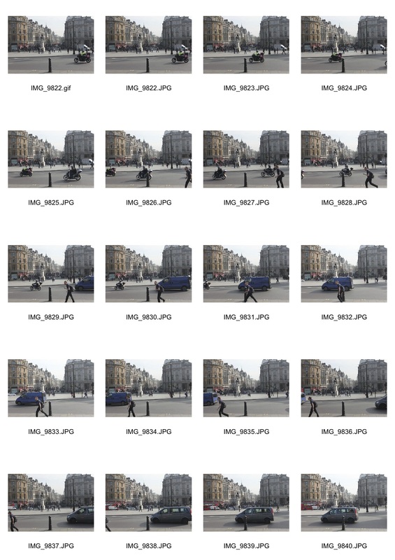
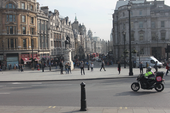
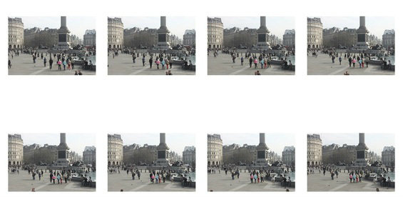
Trafalgar Square: Continuation of city disorder
I visited trafalgar square and took two series of around 30 photographs, for my second response themed around city disorder. I edited them using photoshop so they played one after the other, repeatedly. One gif showed the people walking across the square and the other showed the cars and buses driving past.The constant, jumpy movement seemed to reiterate the concept of disorder I had intended to include in my response. I used tripod to take the photographs so the camera was held still so the background in each photograph was identical.


Buildings
Symétrie Timelapse by Nadzir
The video 'Symétrie Timelapse' by Nadzir includes a number of stills and short video clips showing the symmetry, a key aspect of order, in international architecture. The psychedelic fashion in which the video are presented includes the images duplicating, rotating and changing colour.
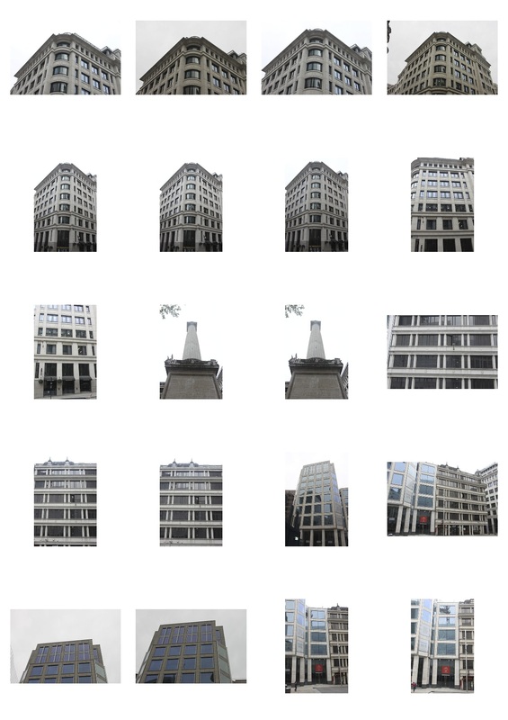
Central London
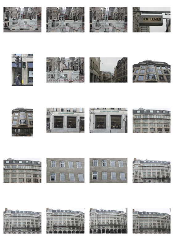
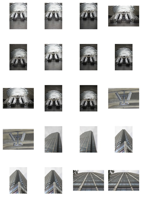
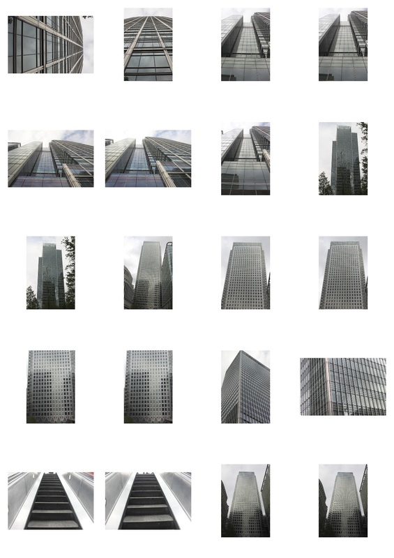
After exploring city disorder, I decided to photograph some of the order within the city. I visited central London and photographed some of the architectural symmetry present on many of the older stone offices and shops.
|
|

The two parallel paths of esculator as slightly blurred, especially towards the bottom of the image, presumably because they were moving when the photograph was taken. The blue stickers and the signs attached to the glass barriers stand out due to their bright colour in comparison to the dull off cream and grey. The high, arched ceiling and the way the end of the escalator is not visible within the image gives a sense of open space which I tried to include in the photograph I took.
|

(my response)
|
Artist comparison

The thin black metal lines of the window frames stand out against the semi- transparent blue tinted glass of the windows. The thickest metal bar runs vertically from up the center of the image. The perpendicular lines of metal running diagonally across the image mean there are two triangle shaped areas of pale blue sky in the top corners of the photographs. The naturally asymmetric positioning of clouds are the only thing making the image feel slightly unbalanced.
|

(my response)
|

The geometric, triangle orientated pattern created by the electricity pylon contrasts heavily with the irregular, asymmetric arrangement of the thin wispy clouds. The obscure angle from which this photograph was taken makes it immediately noticeable. A second semi- transparent image of the pylon has been positioned in the center of the image, adding to the psychedelic feel.
|

(my response)
|
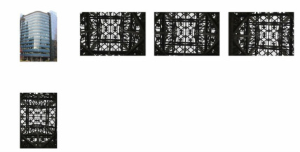
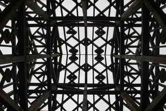
This image was slightly asymmetric because of the angle from which the photograph had been taken. The point of this response was to document symmetry within architectural so I edited it, cropping it in half then mirroring the image so so it was exactly symmetrical.
|
|
|
Original image:
|
After editing:

|

The low angle from which this photograph was taken means the door at the bottom of the image appears to be bulging out and the building looks at though it is bend slightly backwards. The reflection of the white sky is visible in the blacked out, reflective windows, especially on the upper floors. The centre panel of the largest windows runs directly up the centre of the image.
|
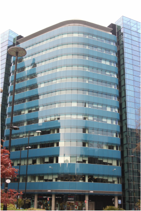
The partially visable tree in the left hand bottom corner of the image helps to give a sense of perspective, indicating the true size and height of the building. The shades of blue and red, clash slightly and the intense colours make this image especially eyecatching.
|
Order and disorder within nature
After photographing symmetry within man made structure, I decide to photograph some of symmetry and balance existing within nature. I also photographed curling intertwined roots and bent trees trunks, to show the heavy contrast between naturally occurring order and disorder within nature. While in France I photographed a local nature reserve in the mountains.
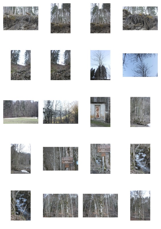
|
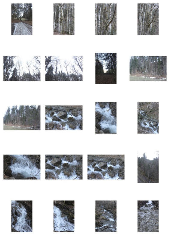
|
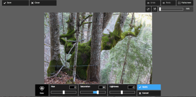
I edited some of the photographs I took, changing the lightening and sometimes the saturation on them. To increase the intensity of the colours on some images I increased to saturation, making them more striking.
How I did it:
(original image)
|
|
Best photographs

|
The trunk of second tree, toward to back of the image runs parallel to the edges of the photographs. Its straightness exaggerates the crookidnes of the thinner branches coming of the main body of the tree. The majority of the trunk of the tree in the foreground is covered by a thin layer of grey lichen. A number of small knots in its trunk appear in the centre of the trunk, the look slightly like eyes, making the photograph slightly eerie.
|
|
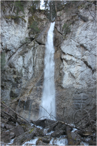
The white water cascading down from the top of the cliffs runs roughly down the center of the center of the image. Twigs from parts of trees which have fallen into the river, stick up at awkward angles at the bottom of the photograph. The green moss and the leaves on the bushes at the top of the waterfall stand out amongst the grey rocks and brown tree trunks. The wet rock closest the water is a darker colour than the dry chalky rock at the edges.
|

|
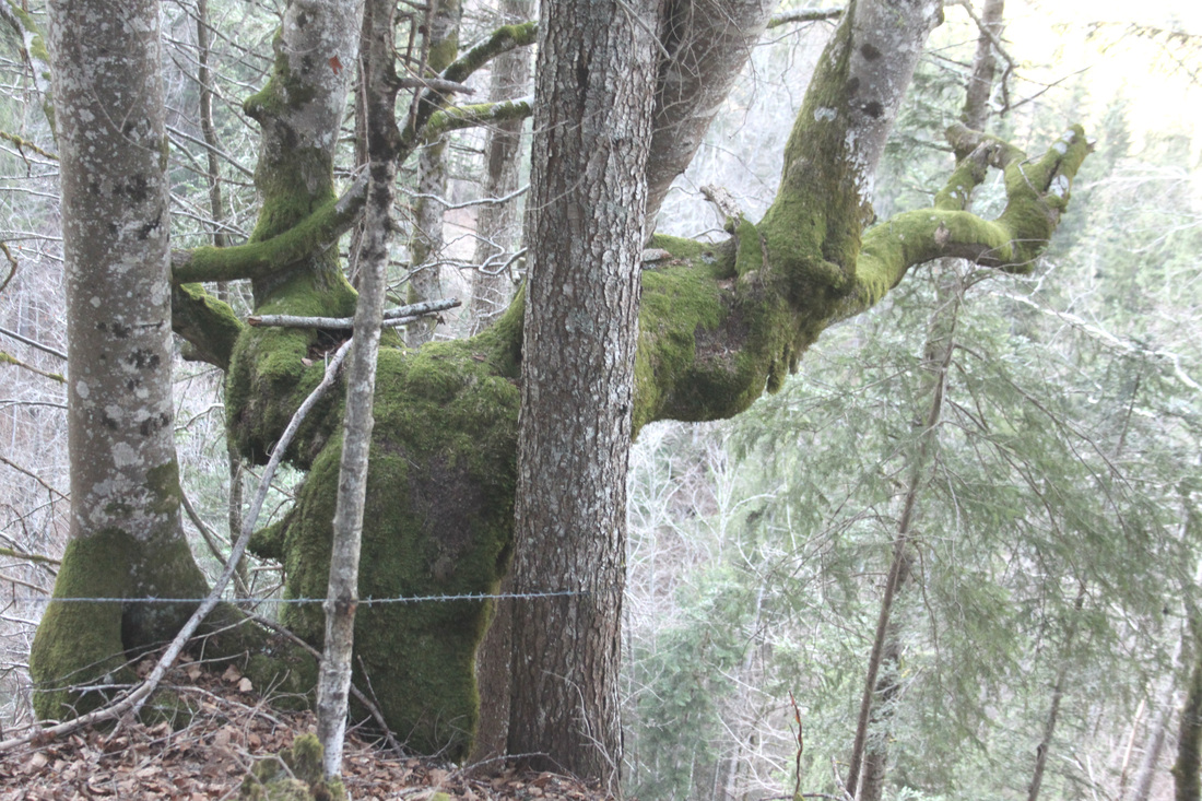
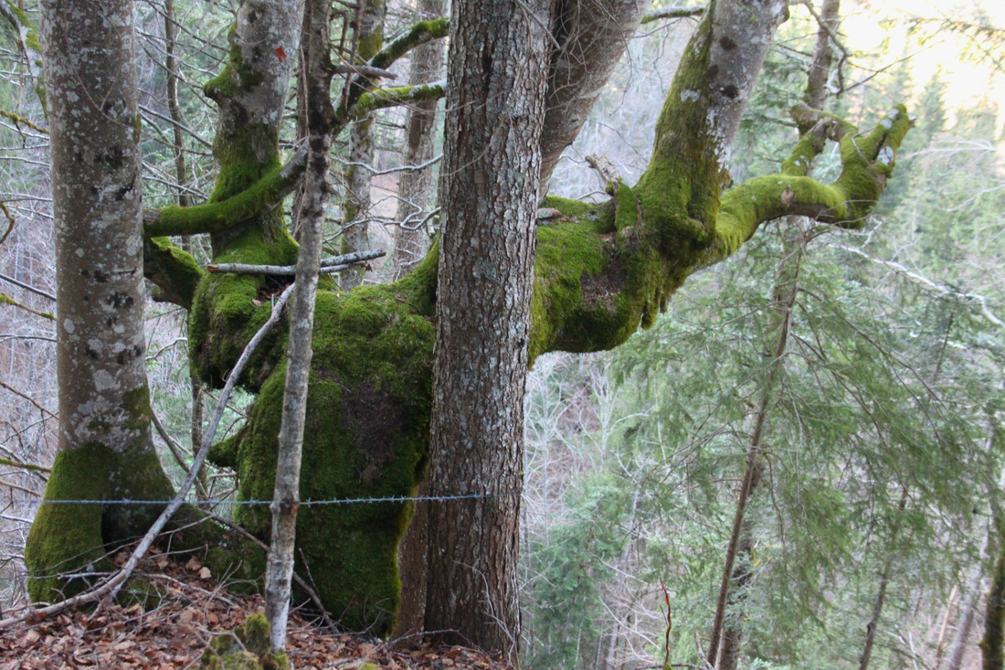
The gnarled shape of the bend trunk is emphasized by the heavily contrast it holds with the two parallel, vertical trunks in the foreground of the image. The bark of the two straight trunks is partially covered by a pale grey/blue moss. The bright green moss covering most the tree makes this image especially noticeable. A thin line of grey barbed wire runs across the left side on the image towards the bottom perpendicular to the trunks of the trees.
|
Mirroring images:
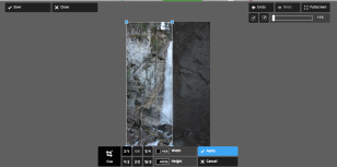
Like I had in my previous response to architectural symmetry, I decided to use the mirror effect on one of the photographs I had taken.
I cropped the image down the center then duplicated it. I reflected the second image it then placed the two images side by side.
I cropped the image down the center then duplicated it. I reflected the second image it then placed the two images side by side.
|
|
|


|

(original image)
|
Final response
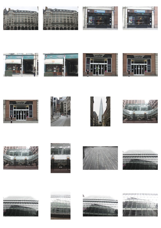
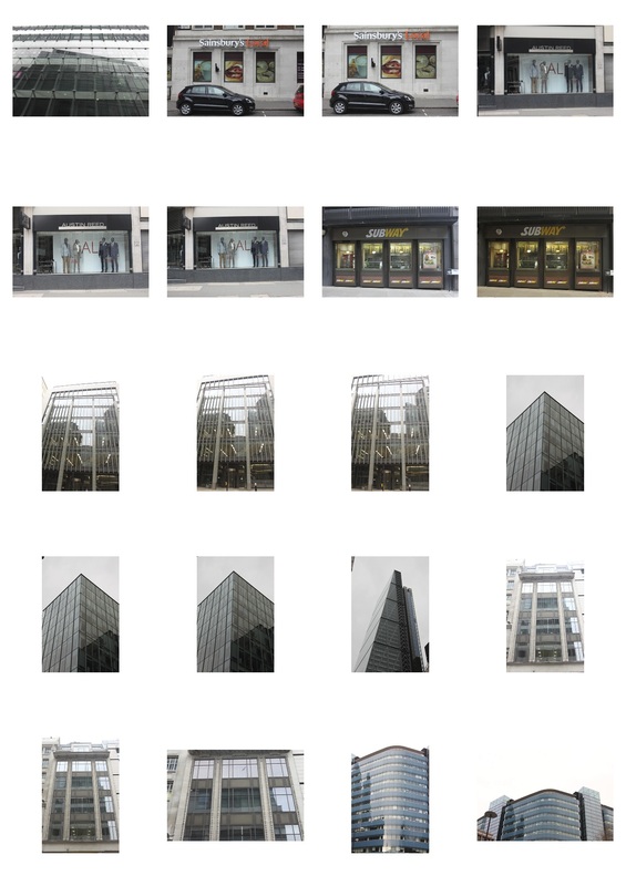
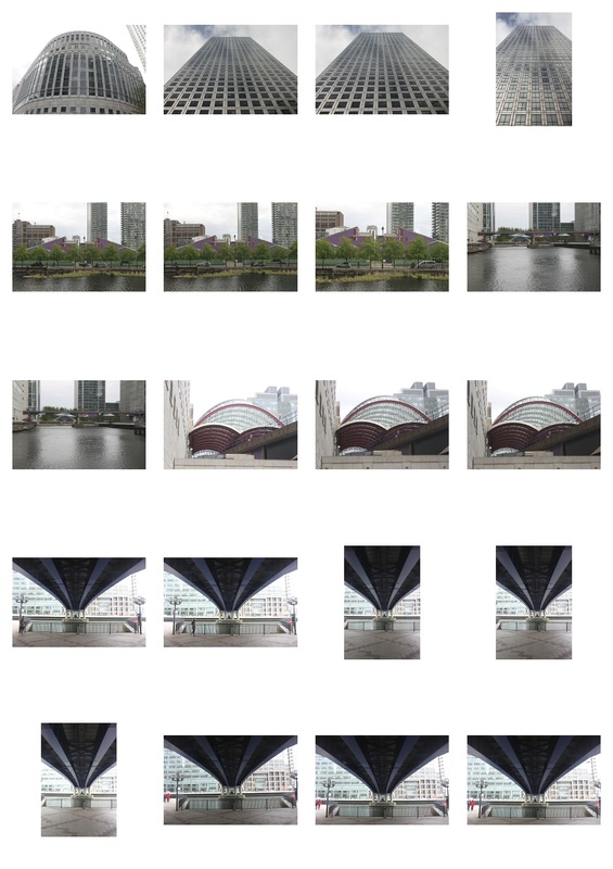
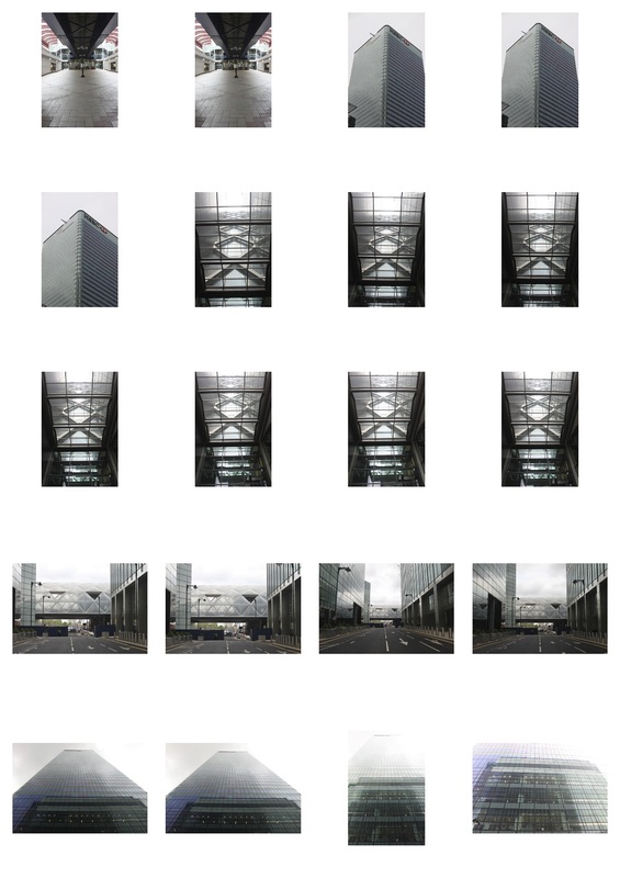
I decided to further develop my work on architectural symmetry. I visited the Canary Wharf tube station in central London and photographed the spacious inside. I also photographed the tall, glass banks in the surrounding area.
|
|
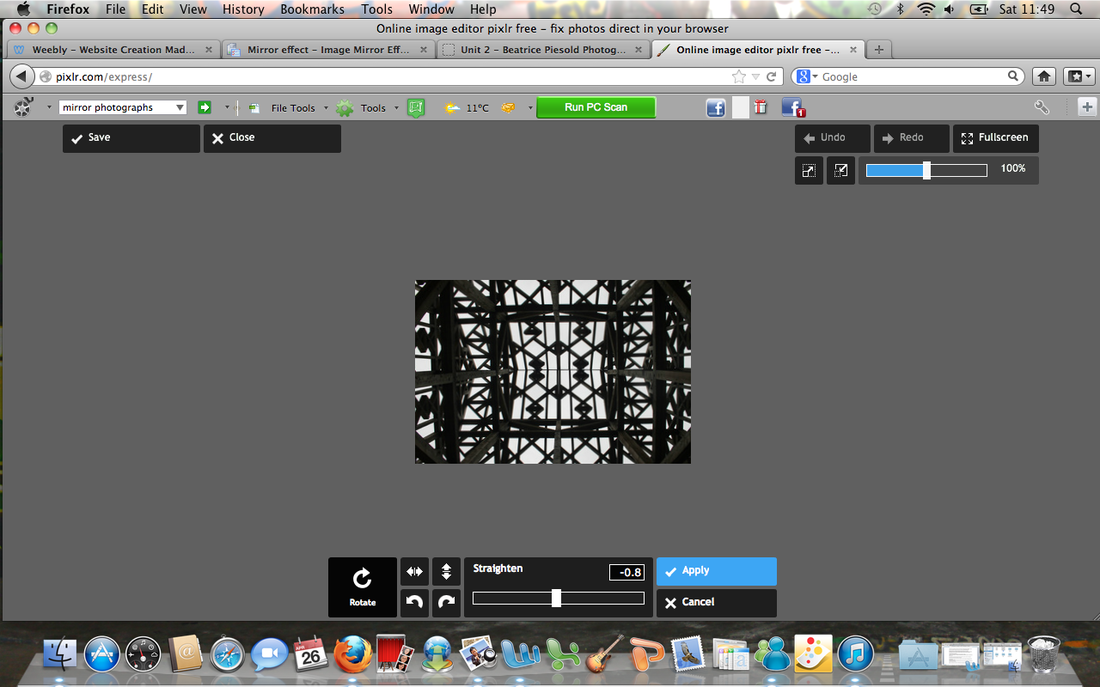
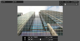
I mirrored the following image using an online editing program. I straightened the image and cropped it down the center using photocopy. I then reflected it from the left hand side.
|
|

(image before mirroring)
|

(original image)
|

|
Favourite images:

|
The tall building in the centre of the image looks as though it is thinner towards the top because of the angle form which the photograph was taken. It appear far taller than the poorly lit building surrounding it as it is in the foreground. The dark, slightly solemn lighting and the grey clouds makes it seem as though a storm is coming. Although the building is made predominantly of glass, nothing inside it is visible; the glass reflects the dismal grey lighting. The metal surrounding the windows looks silver in comparison to the grey clouds surrounding it.
|

|
This structure is made primarily of glass panelling. The glass towards the bottom of the image appears blue and purple, its strong colour is exaggerated by the heavy contrast it holds with the white sky. The images give the impression the building curves slightly towards to top. The concave in the centre of the image shows a disconcerting reflection of the opposite edges of the building that jut inwards.
|

|
Then size of this building isn't apparent as their is nothing to put it into perspective. The blue tinted windows run in consecutive parallel lines up the image. The turquoise colour of the glass clashes with the blue of the sky. The wispy, tangled looking shape of the clouds holds a strong juxtaposition with the geometric shapes of the building. The windows are slightly darker is certain patches due to shadowing from object out of view, behind them.
|
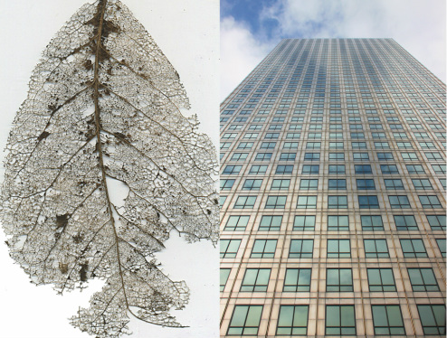
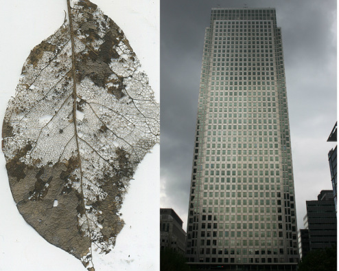
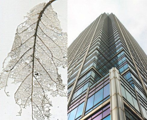
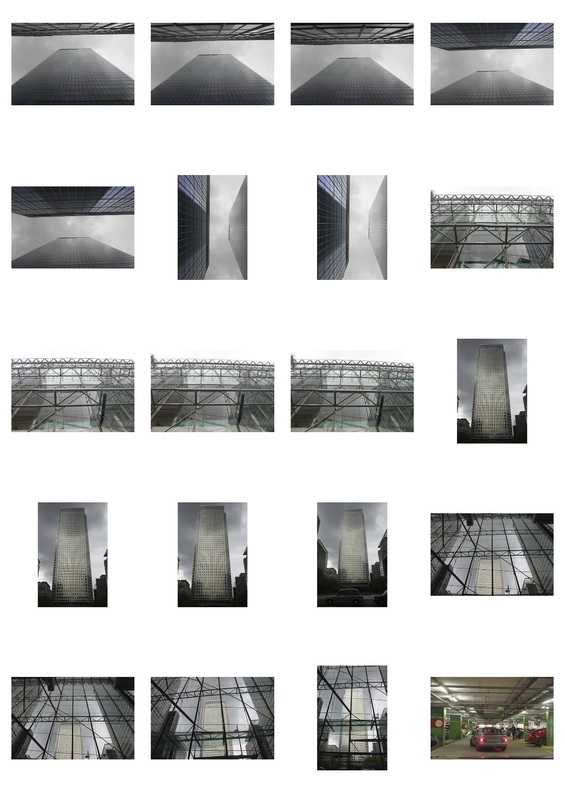
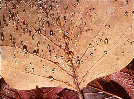
Tony Howell
Tony Howell's photography of leaves is demonstrative of symmetry innately occuring in plants. Although, the balanced distribution of the duplicate parts, across a large surface area, is a evolutionary adaption intended to maximise photosynthesis, it is also extremely aesthetically pleasing. Though leaves are often considered symmetric, it is unusual for them to match up when folded in half. The symmetry found frequently in architecture is an attempt at replicating the naturally existing balance and order within nature, that human beings appear to be so drawn to.

|

|
|
For my response to the work of Tony Howell I created a number of leaf skeletons. I boiled green leaves in water containing dissolved washing powder. I removed the leaves half an hour later using tweezers then left them to dry. Once they had dried I used a makeup brush to remove the remained dried out fragments of chlorophyll. I tried photographing them against a white background, but this proved ineffective so I decided to scan them.

|

|

|

|
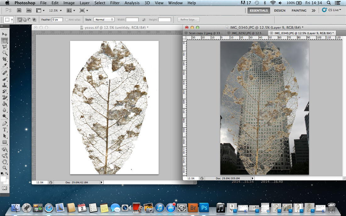
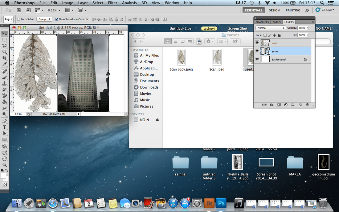
I experimented with photoshop, making the images of leaf skeletons into transparent layer the pasted them on top of the images of the photographs of architectural symmetry.The result was not as expected as the leaf skeletons were basically invisible unless highly saturated which made their colour look unnatural.
|
Final Piece
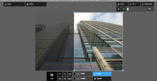
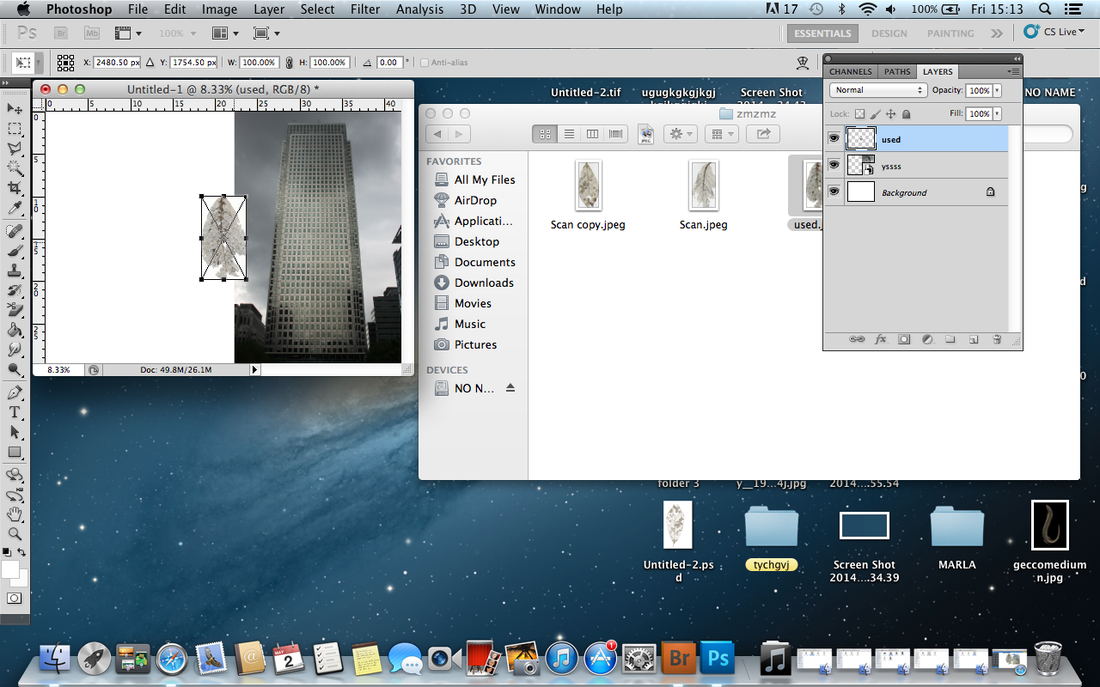
For my final piece I edited, using photoshop, scanned images of a leaf skeletons next to the photographs of architectural symmetry I had taken. I sharpened the images of leaves so all the cracked parts were visible and well defined. Putting the two sets of photographs next to each other meant the two were easily comparable. I intended to showed the similarities between the inherently occurring symmetry within the natural world and man-made architectural symmetry.
How I did it:
|
|